Principal Component Analysis in R
This article describes a practical application of one of the most used factor analysis techniques - the Principal Component Analysis (PCA) – and provides a step-by-step guide summarizing the different steps to follow for conducting a PCA on a real data set using R software.
R packages for PCA
There are a number of R packages implementing principal component methods, such as stats, FactoMineR, ade4, MASS, etc.
In this article, we’ll use:
- the FactorMineR package to compute PCA
- the factoextra package for visualizing the results.
Before diving into code, let see what functionalities provides the factorextra package (a comprehensive list can be found here).
There are two set of function related to PCA in factorextra:
a. Functions for extracting data from dimension reduction analysis outputs such as
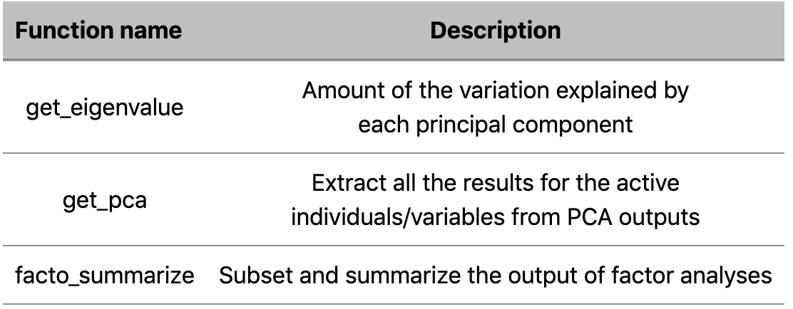
b. Functions visualizing dimension reduction analysis outputs
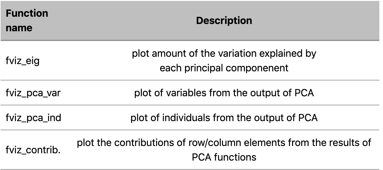
In this article we’re going to use functions belonging to both of those sets.
A practical example
We’ll perform Principal Component Analysis on a dataset containing 29 types of cheese characterized by their nutritional properties (10 variables). The raw data and the full code are available here.
Processing tasks
Performing PCA involves different steps, as listed below
• Set working space an Importing the dataset
• Data Pre-processing
• Compute PCA
• Plot PCA’s results
• Description and interpretation of the results
Set working space and Importing the dataset
# Setting current working directory
setwd("…./")

# Loading Necessary Libraries
Library(FactoMineR)  # used for computing PCA
library(factoextra)  # used for visualizing PCA results

# Load the data
cheese <-read.table("/…cheese.txt",header=TRUE, dec=".")
Our dataset looks like this
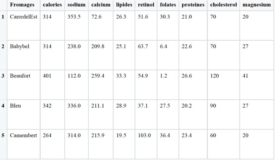
Before starting our PCA, we need to perform few tasks of data preprocessing.
Data Preprocessing
# Setting row names according to cheese’s names
new_rownames <- as.matrix(cheese[1])

rownames(cheese) <- new_rownames

# Deleting from the DF the categorical column containing cheese’s names
cheese[1] <- NULL

# Data Standardisation
cheese_st <- scale(cheese)
Compute PCA
To compute PCA we use PCA() function available in the FactorMineR package.
Its basic syntax is:
PCA( x,           # matrix or data frame containing the data for the PCA
     scale.unit,  # T/F to indicate to standardize or not the variables(default T)
     ncp,         # maximal number of principal components to be used (default 5)
     ind.sup	  # supplementary individuals (default NULL)
     quanti.sup	  # supplementary quantitative variables (default NULL)
     quali.sup	  # supplementary qualitative variables (default NULL)
     graph 	  # T/F If T output graphs
     axes) 	  # vector of dimension to consider (default c(1,2)
res.pca.factor <- PCA(cheese, graph = F)
We assign the PCA’s results to the res.pca variable
Plot PCA’s results
The first thing to do, in order to define how many principal components should be analyze, is to figure out the percentage of variances explained by each principal component calculated from our dataset.
In order to do that, we can choose between a visual approach or a numerical approach:
- The numerical approach consists in calling the get_eig() function on our res.pca.factor object
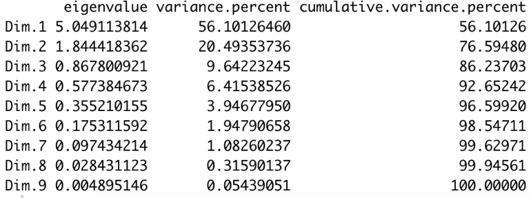
The get_eig() function returns the Eigenvalues, i.e. the amount of the variation explained by each principal component (PC).
# Getting eigenvalues
get_eig(res.pca.factor)
The output is a matrix containing the eigenvalue, the percentage and the cumulative percentage of variance for each dimension.
- As alternative, we can use the visual approach, consisting in calling the fviz_eig() function.
It will return a plot showing on the horizontal axis the dimensions and on the vertical axis the relative percentage of explained variance.
# Getting eigenvalues
fviz_eig(res.pca.factor,
	 addlabels = T,  # add labels showing the % explained by each dimension.
         ncp = 5)        # number of dimensions to plot
       + theme_gray()    # customized theme for the plot
The result is the following plot
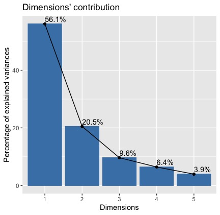
We can see that the 1st and 2nd dimension explain together 77% of the total variance in our dataset. So, our analysis can focus on those two principal components.
Let move on and visualize the results for individuals and variables.
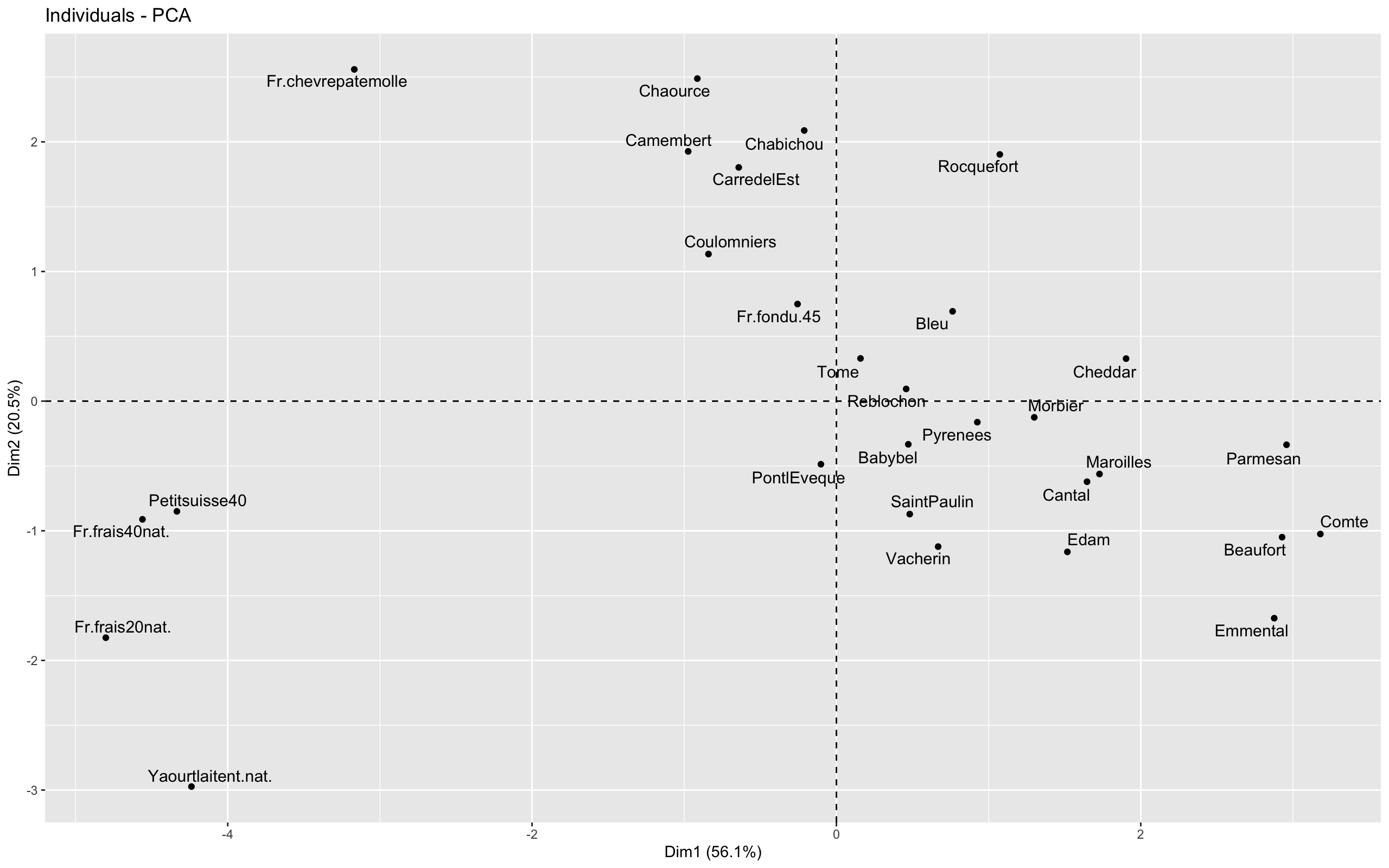
To plot the individual graph, we use the fviz_pca_ind() function, as follow:
fviz_pca_ind(res.pca, axes=c(1,2), repel = T) + theme_grey()
The result is the following plot
To plot the variable graph, we use the fviz_pca_var() function, as follow:
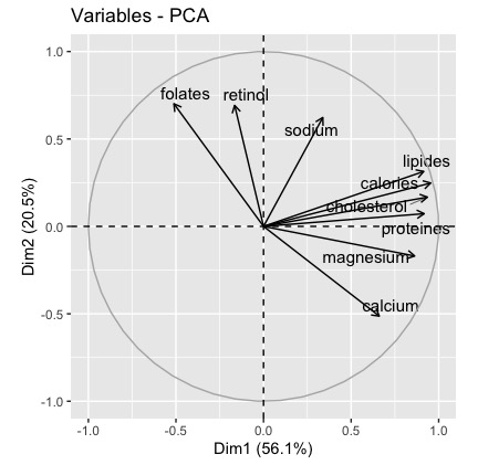
fviz_pca_var(res.pca, axes=c(1,2), repel = T) + theme_grey()
The result is the following plot
Description and interpretation of the results
In order to interpret the PCA results, we start from interpreting the graph of Variables, in order to understand how we can characterize each dimension.
To this, we need of quantitative information about contributions of variables to each principal component construction.
This information can be found by analyzing two metrics:
- The correlation coefficient between each of our dataset’s variables and each dimension
- The contribution of each variable to the construction of each dimension.
The first metric can be accessed by using the following code
res.pca.factor$var$cor

or by calling the dimdesc() function available in the FactorMineR package
# correlation variables/dimensions
dimdesc(res.pca.factor)
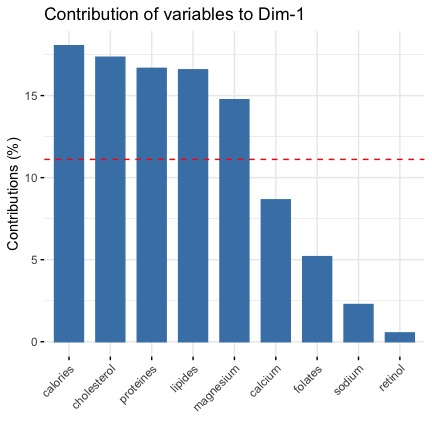
For the second metric, i.e. the contribution of each variable to the construction of each dimension, we adopt a visual approach by using the fviz_contrib() function available in the factorextra package which produces a barplot.
#-----contribution of variables to the construction of the dimensions
fviz_contrib(res.pca.factor, choice = "var", axes =1)
fviz_contrib(res.pca.factor, choice = "var", axes =2)
This plot for the first dimension is this
For the second dimension is that
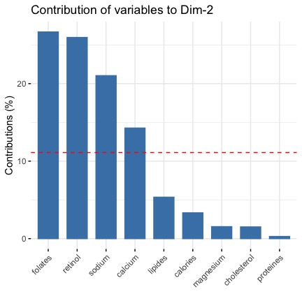
Both metrics (coorrelation and contribution) give us the same information:
- the first dimension is defined by 3 variables calories, lipids and cholesterol (which are positively correlated to the dimension 1 and highly correlated each other)
- the second dimension is defined by retinol, folates, sodium (positively correlated to the dimension 2) and by the calcium variable (negatively correlated to the dimension 2)
If we transpose these insights to the graph of Individuals, we can conclude that:
- data points located on the right correspond to cheese having caloric and fat values greater than the mean (at the opposite, data points located on the left are less caloric and fat than the mean)
- data points located on the top correspond to cheese having sodium, retinol and folates values greater than the mean and, at the same time, calcium values lower than the mean (at the opposite, data points located on the bottom have level of calcium higher than the mean and level of sodium and other two components lower than the mean)
